Every time I get on the 405 North in Los Angeles and see that sign: I-405 to Sacramento, I always think it's a bit weird. That's supposed to help me? Sacramento is 6 hours away and there's plenty of other places that we Angelenos are probably actually headed to in-between. Sherman Oaks, San Fernando, Santa Clarita... hell even Bakersfield or Fresno seem more relevant. Or on the other hand, if you're gonna go big, why not just say Seattle?
I guess my point is... what's the deal with these signs? You can't tell me you haven't wondered. I mean your GPS navigation's voice reads them to you all the time! Which cities do they use? How'd they decide on them? Which city has the most miles of signage? Is there a city that has a sign a ridiculous distance away? What is the meaning of life?
Collecting the data
Like any good internetting detective I started on wikipedia and quickly learned that the American Association of State Highway and Transportation Officials calls these Control Cities, and publishes a list of them, but it's only got a handful of interstates and no juicy details of where along the routes each city appears on signs.
So to determine the control city along both directions of every interstate in the US, I politely asked my computer to querey Google Directions for 459,072 carefully chosen pairs of starting-points & destinations.

For more technical details on how exactly I did this, check out the sauce.
Mapping the cities
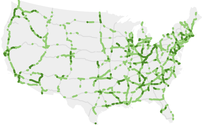
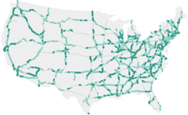
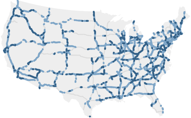
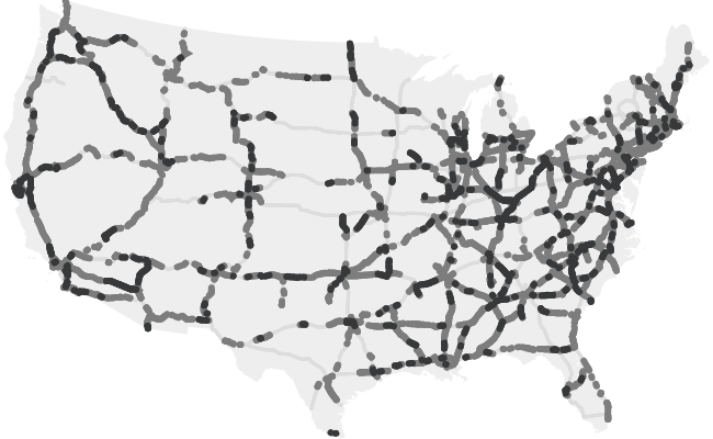
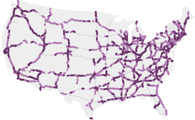
Armed with a giant stack of verbal directions from anywhere to anywhere, we can now start stringing them together to make some sense of it all.
The map below shows the segments of signage for each city on the interstate.
Hover (or tap) on the gray segments to explore which city is which.
It should be noted that for this city-focused analysis, I removed all non-city things like airports, bridges, roads, universities, states, countries etc...
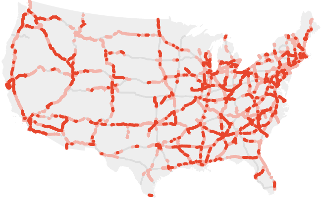
There's a couple patterns that jump out right away. If you're like me and you've logged your fair share of interstate miles, you'll find these intuitive:
- Cities are generally signed from both directions with a signage gap in the middle where the actual city is. Usually there are signs for specific roads and exits when approaching the city center, so this makes sense. Signage for Long Beach and Santa Monica along The 405 illustrates this.
- Signage for a given city from a given direction is not necessarily continuous. Again... We've all experienced this. Sometimes a route towards a big city can be temporarily overtaken by a medium sized city. Signage for Miami along I-95 S illustrates this.
One thing that came by surprise to me though, was how often there are cities that are only signed from one direction. Signage for Omaha and Council Bluffs along I-80 illustrates this. It would definitely be harder to notice this as a driver as it's not often that you're comparing signs from one direction of your trip to another.
After seeing a few of the maps above, you start to wonder: Which cities show up the most often? I wrestled with the different ways to answer that. On one hand, we want to see which city has the most mileage of signage, but on the other hand if we think of the whole region around the highway as being the territory of that city, then we can create a map the territorial regions of each city - which just sounds cool. So let's explore both.
Select a few cities:
The territory area in these maps is the region for which that section of interstate is the closest section of interstate. In other words, every person living in Seattle's "interstate territory" can say that their closest interstate will point them toward Seattle.
For some perspective here: Billings, Montana's "interstate territory" is larger in area than the entire country of Italy. Crazy.
A couple interesting observations:
-
Extending our earlier observation, we see that generally cities tend to be approached from all directions with a donut hole carved out in the middle for local "downtown" signage.
Denver is a cool example of this. -
While signs for highly urban cities do sprawl out directly from the city center, they also show up as small patches in other nearby big cities,
Leaving the rural gaps in between to be signed for smaller local towns.
This ultimately creates a "urban-to-urban" and "rural-to-rural" convention.
St Louis, and Chicago both are good examples of this. -
Being that the East Coast is generally more population (and thus interstate) dense than the West, East Coast cities have smaller territories.
See for yourself
City Superlatives
Enough maps already, let's get to some numbers. The table below shows the summary of the statistics for all 1184 signed cities in the lower 48 United States. In addition to the mileage and territory stats, I've also included the quantity of interstates each city is signed on, as well as the distance from the city center to the farthest sign.
Sort by:
Search:
Determining which signs go where
I have no idea how or why the cities were chosen. In order to try and wrap my head around the signage we have today, I figured I'd see if I could reproduce it.
I tried a few different models to try and predict which cities would appear on which signs. No, not that kind of modeling... modeling is a word which here means building a fake thing to represent a real thing.
Let's put ourselves in the shoes of the sign makers. If we had to pick which city we're currently headed towards, we'd probably pick the most prominent city that lies ahead.
But what exactly does prominent mean? Who knows!? We know we'll want to somehow incorporate both population and distance. I tried 7 definitions:
- Tallest Tower - Each member of a city stands on each-other's shoulders forming a giant tower. Whichever city's tower appears the tallest from where we are, is the one we pick for the sign.
- Tallest Triangle - Members of the city line up in a single file line and kneel on the ground. Subsequent members kneel on their backs, and then another group on theirs etc. forming a giant cheerleader triangle. Whichever city's triangle appears the tallest from where we are, is the one we pick for the sign.
- Tallest Pyramid - Members of the city clump together in a square formation and kneel on the ground. Subsequent members kneel on their backs, and then another group on theirs etc. forming a giant pyramid. Whichever city's pyramid appears the tallest from where we are, is the one we pick for the sign.
- Tallest Super-Ultra-Hyper-Mega-Meta Tower - Each member of a city stands on each-other's shoulders forming a giant stack. A photographer takes a photo of this stack and delivers a copy to each citizen. The citizens each find a very tall tree and carve a totem pole as a replica of the original tower. The citizens all meet the next day and stack their towers together. (yes Los Angeles's tower would go past Pluto) Whichever city's tower appears the tallest from where we are, is the one we pick for the sign.
- Big and Close-ish - We pick the most populous city within 500 miles for the sign.
- Big and Close - We pick the most populous city within 100 miles for the sign.
- Big and Very Close - We pick the most populous city within 50 miles for the sign.
I also have to point out that the Tallest Tower and the Tallest Triangle prediction schemes actually have some cool corrolaries in the sound-wave-propogation world. The perceived loudness of a city full of people chanting in unison would yield the same predictions as our Tallest Tower scheme. The perceived loudness of a city full of people individually talking (incohenrent grumbling as a group) would yield the same predictions as our Tallest Triangle scheme.
None of these schemes are perfect. In fact, they all hover around a 1-out-of-3 success rate. For every 3 times I see a highway sign, we'll be able to predict the listed city 1 out of those 3 times. Which isn't too bad considering these cities were probably determined somewhat arbitrarily 30+ years ago.
One observation is that there some areas that are generally predictable by all schemes (IN,OH,KY region), and a couple areas where they all fail (anything between Texas and Canada). Part of this could certainly be due to the fact that this is a city-focused analysis, and some of the more rural signage could be for states and not cities, a gauranteed failure for any of our schemes.
As the data below indicates, the simpler methods of "choose the biggest city within X miles" tend to do pretty well overall, correctly predicting signage on 35% of the US interstate mileage.
Comparing Prediction Accuracy
Looking at the interstate-by-interstate breakdown (tap the "show details" button), indicates that though the Big and Close method was the best overall predictor, Tallest Tower, (3rd best overall) was able to score the highest success-rate for a single highway, correctly predicting 92.87% of signs on the Northbound side of I-37.
Final Thoughts
Well that was fun. This all began from my curiosity regarding the signs for Sacramento I see in the middle of LA. I now can chalk it up to the fact the signs tend to match the urbanicity of the source to the destination. Also, though this LA-to-Sac-town phenomena is in the top 10 for distance from sign to city, it doesn't hold a candle to 74-person Butte City Idaho's 218 mile-away sign on a 'per-capita' basis.
I'm definitely interested in trying some more prediction schemes in the future that incporporate some of the observations I've learned along the way. Paritucularly the afformentioned trend of rural areas tending to sign for nearby rural areas, and urban areas tending to sign for more distant urban areas.
And remember how I mentioned that the 25% accurate Tallest Tower prediction scheme was analagous to The perceived loudness of a city full of people chanting in unison? Well just think... next time you're driving along the interstate... Look at the signs above you, and imagine a zombie mob of the citizens of that town chanting COME VISIT US IN SEATTLE... Well, 25% of the time, that zombie mob would be louder than all the other town's zombie mobs! It's science!
Also, 100 points to you if you noticed the highway sign font. I'm guessing the slanty top of the b d h k l t was either a dead give-away, or something that you'll now notice it on every sign for the rest of your life and think of this article every time you see it.